
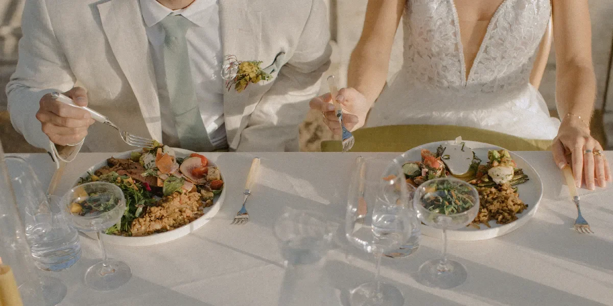

Field to Table Events & Catering
Creative Director and Website Design for a highly regarded catering company.
The Ask
Field to Table Events is a highly regarded catering company across California, with features in publications such as Vogue, WeddingWire, and Vanity Fair. Known for its bespoke, farm-to-table approach, the brand creates deeply personalized culinary experiences tailored to each client’s vision and palate.
Despite its strong reputation, the brand lacked a cohesive digital presence and elevated identity that fully reflected the quality, intentionality, and craftsmanship of its work. The goal was to differentiate Field to Table within a competitive market while remaining grounded in its Central Coast roots and values.
The Solution
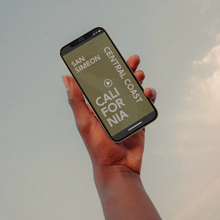
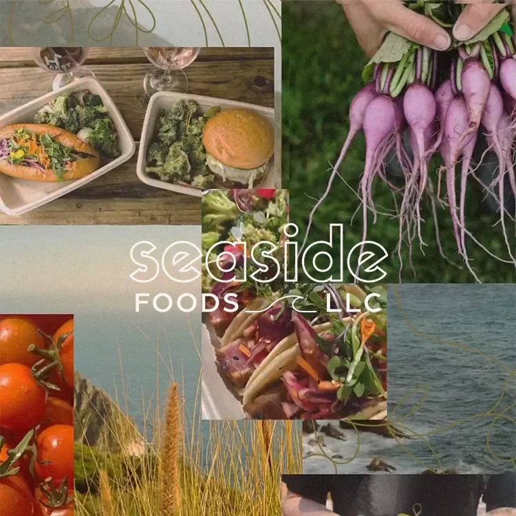
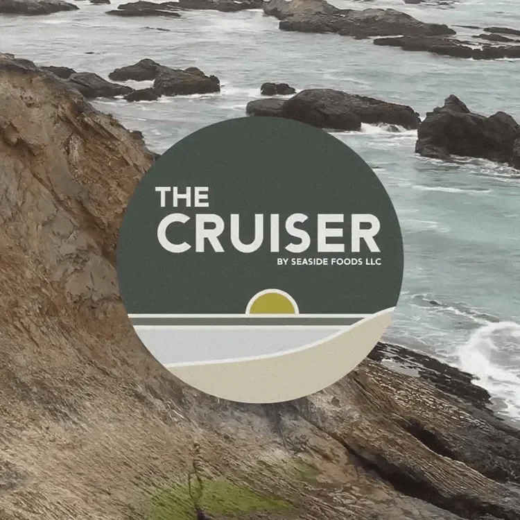
Following the success of the core brand refresh, I led the next phase of creative direction across the company’s extended offerings. This included developing a distinct identity system for their West Coast food truck and restaurant concept, Seaside Foods, in partnership with Hearst Ranch. The goal was to position these sister brands within the broader California coastal lifestyle while maintaining alignment with the parent brand. This work supported the development of their core message, “Savor the Seaside,” reinforcing a sense of place, experience, and elevated simplicity.
Key Initiatives
-
Redefining the brand’s visual direction, creating a refined yet approachable identity that balanced elegance with its farm-to-table origins.
-
Designing a streamlined, user-friendly website, improving navigation and storytelling to better guide potential clients through the experience and offerings.
-
Elevating brand storytelling, highlighting the company’s commitment to locally sourced ingredients, customization, and thoughtful hospitality.
-
Ensuring the digital experience reflected the sensory and experiential nature of the brand, translating its in-person excellence into an online presence.
The Results
The result was a cohesive brand presence that elevated Field to Table’s positioning while staying grounded in its roots. The new website and creative direction improved clarity, usability, and connection with its ideal clientele, translating the in-person experience into a stronger digital presence while preserving the brand’s authenticity and craftsmanship.
Following the core refresh, I led creative direction for the company’s extended offerings. This included developing a distinct identity for their West Coast concept, Seaside Foods, in partnership with Hearst Ranch, and helping position these sister brands to reflect a California coastal lifestyle while remaining aligned with the parent brand. I also supported development of the core message, “Savor the Seaside,” reinforcing a clear sense of place and experience.

Brand Cohesion
Cretive Direction
Distinct Identity